Designing the Princeton Prosody Archive User Interface & Interactions
10 June 2019
This essay is reposted from the Princeton Prosody Archive, where it was originally published in the Editorial section.
In this essay I will cover the design highlights of Princeton Prosody Archive (PPA) in the scope of my contributions. It is important to note that at the time I became involved in this project both the information architecture and the user interface had been largely designed by the previous User Experience Designer, Xinyi Li. Therefore my contributions for this project were focused on refining the earlier decisions based on best practices.
The earlier stages of the design process encompass many important decisions. Design includes structuring information by creating taxonomies, creating an information flow by proposing navigation types and positions, and higher level designs of the page layouts. This process requires employing a holistic approach geared towards consistency in the structural, interactive, and visual language on a single page, a section, and the website as a whole in order to create a cohesive experience. These earlier stages are when user research and usability testing are typically conducted, which allow design decisions to be made or revised based on data and feedback from potential users similar to the target audience.
I categorize my contributions in the following ways :
Color
1. Added new colors based on project theme and guidelines for making the site usable for users with accessibility needs.
2. Created color themes throughout the site.
Interactivity
3. Used colored shapes (e.g. triangle on navigation bar) to indicate what section of the site users are on, and developed an animation to indicate when search results are loading.
Typefaces
4. Systematized the use of typefaces + their sizes throughout the site to streamline the web developers’ work and to create a cohesive design system.
Content Hierarchy/Organization
5. Rearranged content, mainly on the archive search section to decrease cognitive overload.
Color
The original bibliography for the project is T. V. F. Brogan’s English Versification, 1570-1980, A Reference Guide with Global Appendix, published in 1981. Brogan, a literary scholar and computer programmer, created an online version of the project in hypertext Adobe Acrobat PDF format in 1998 that is still housed at Oregon State University under the auspices of the journal Versification. Though the links in EVRG (Brogan’s name for the PDF version of the book) are long broken, they bear the bright blue traces of Brogan’s hopes for an online version of the project that could generate a network of discourse prior to the turn of the century. Because of Brogan’s “dream of the 80s,” Project Director Meredith Martin had the idea of employing an 80s color theme for PPA, to communicate to users that this is an inviting and playful project. This choice led me to an initial focus on revising the color and visual theme of the web application.
After conducting some research on both what 80s colors actually look like and how they are perceived, I got a general idea of the kinds of colors I needed to look for. 80s colors tended to have cool tones; however, I needed help narrowing down to the appropriate shades and their potential appropriate degree of brightness. It wasn’t until the Project Manager, Mary Naydan, provided an example of how she and Meredith envisioned the color combinations that I saw the potential. After carefully assessing the accessibility requirements for the selected colors and deciding how to best use them on the site, I chose the four colors (Figure 1). These bright colors were selected to convey a sense of playfulness, instability, and ongoing discovery and conversation, reflecting the characteristics and the processes that went into developing this project. The cool tones add a modern twist to our interactions with the archive, prompting us to ask “what does it mean to interact with this archive today?” and “what ideas can we generate from this archive for the future?”
Once I began the color revision process of the logo I began to create a consistent and coherent visual design system throughout the PPA sections. In order to add further meaning to the colors of the PPA logo, each was used as a theme for a pivotal section of the site. I made this decision to further communicate how each section of the site is significant on its own; each has played a role in turning this project into what it is today. Thus, I intend a sense of ethical parallelism of site content as a whole to be represented through the visual design, emphasizing the inclusiveness and equality of the site sections while minimizing hierarchical structures.


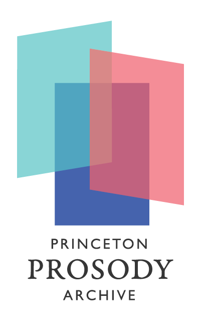
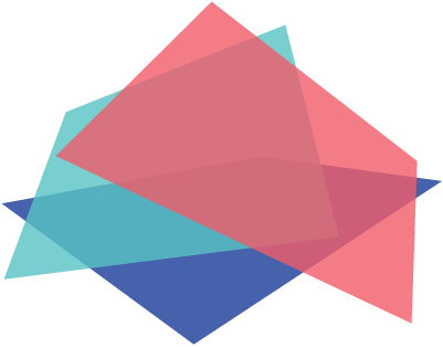
The logo shown above was created with three low-opacity, filled-in, overlapping rectangles, creating a layering illusion. This was inspired by the monochromatic PPA logo designed by Xinyi Li for use in the footer, shown in Figure 3. It is currently in use as the main logo on the homepage of the website. This colorful logo was designed to communicate the playful and celebratory character of this project.
Three of the colors shown in Figure 1, French Blue, Seafoam Blue, and Rosy Pink, each represent a part of the logo. In order to create a cohesive visual identity and a color system for the PPA, the three colors used for the logo–along with “Twilight”–are used as theme colors for the corresponding main sections of the site. An example is shown in Figure 4.
The theme colors are as follow:
- “About” section and its related pages – Rosy Pink
- “Home Page” – French Blue
- “Collections” and “Archive” – Seafoam Blue
- “Editorial” – Twilight
“Editorial” is the only section where Twilight is used, mainly because this section differs from the rest of the site in the nature of its content and the fact that it will include materials from multiple authors.
Due to an accessibility guideline that requires a certain percentage of contrast between foreground and background colors, and in order to create a more inclusive and inviting product, French Blue was the only color I selected to use alongside the text. It is used as a background color to white text used for buttons and as the text link color. (Web accessibility consists of a set of guidelines to ensure there are no barriers that prevent interactions with or access to digital products on the World Wide Web by those with accessibility needs.)

Figure 4 – Thematic approach applied to the Collections section
Initially, I designed two different versions of the logo. An outlined version (see Figure 6, below) and an alternate version of the final, filled-in logo (see Figure 5, in comparison with Figure 2). At the time, the team decided to use the outlined version for the project homepage and keep the filled-in version (Figure 5) for promotional materials. Later on, in the process of ordering promotional materials, I learned that the complicated logo, with its multiple colors, transparency, and overlap, would be incredibly difficult and expensive to print accurately. In collaboration with the team, I revised my decisions about the logo; we now use the outlined logo in color (Figure 6) and black and white (Figures 7 and 8) for promotional products, and the filled-in version consistently on the website. One of the main goals of this revision was a consistent branding approach for the project across the website, social media, and promotional materials.
The first version of the filled-in logo I designed (Figure 5) is no longer in use for digital or print purposes and has been replaced by a simpler version (Figure 2). This version of the logo is not constructed of three overlapping rectangles; instead, it is composed of seven shapes with variable opacities and colors that do not overlap. This logo was constructed in such a way as to allow a more customized and playful “overlapping” effect with increased vibrancy in the colors. This was the same approach that was used to construct the monochromatic logo earlier in the project by the previous designer, Xinyi Li. This approach does not cause problems for the monochromatic version of the logo because it appears as a static visual on the footer of the website. However, this version of the filled-in, colored logo was impossible to use on the homepage, where the logo is not presented as a static image, but is instead displayed as three different images that move independently. This dynamic version is designed to move around slightly as users move their mouse or their device (e.g. tilting or shaking a tablet or phone). The dynamic version of the logo helps convey the playful aspects of the site as well as the multiple prosodic perspectives included in the collections.

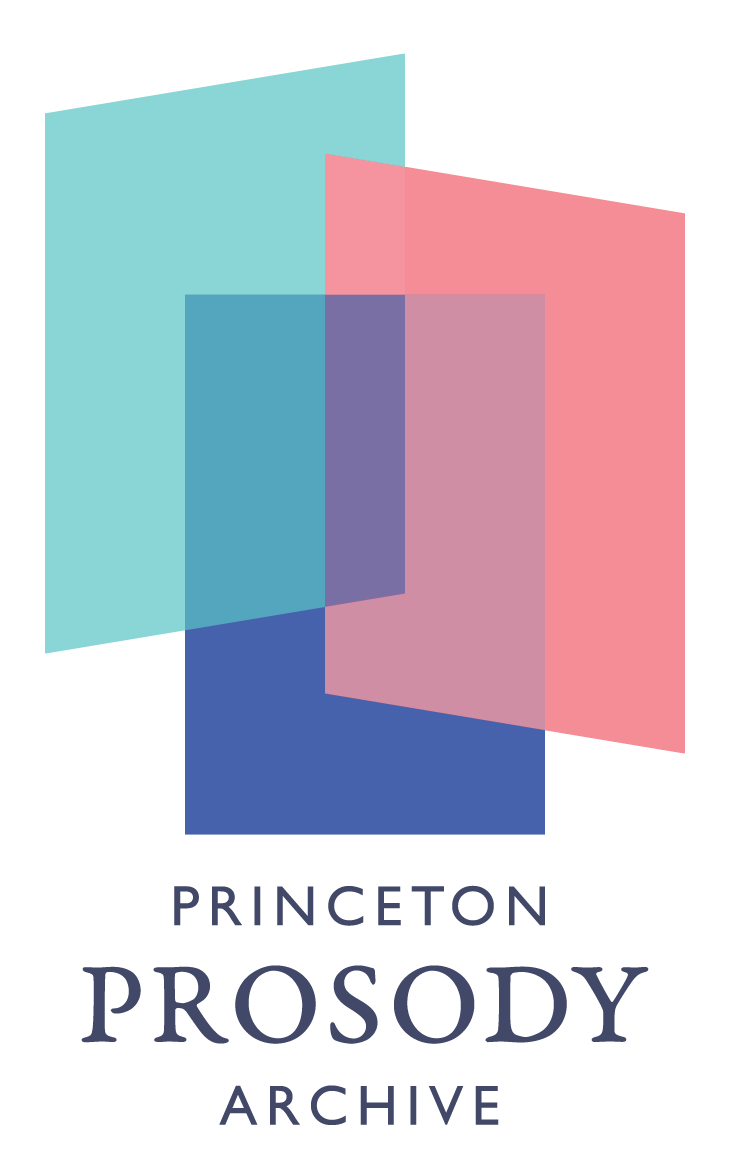
Figure 7.2 – Alternate logo for promotional materials (black on light background)

States
The second category of work that I focused on was creating visual cues that would communicate the state of the interface to users as they journey through the site, by using relevant shapes and colors.
The states designed belong to four categories:
1. Triangles on the navigation bar. These appear on the section that is currently being viewed by the user. This gives the user an indication of where on the site they are at all times.

2. French Blue buttons with white text. This is to communicate:
a. The presence of buttons to navigate to other parts of the site, i.e. available options from which users can select.
b. The active state of collection filters, menu options, and page numbers on the archive search page.


3. An animated icon. This conveys that results are being loaded based on search and filter options entered by the user. This icon is a simplified variation of the logo, which helps maintain a cohesive visual identity throughout the site.
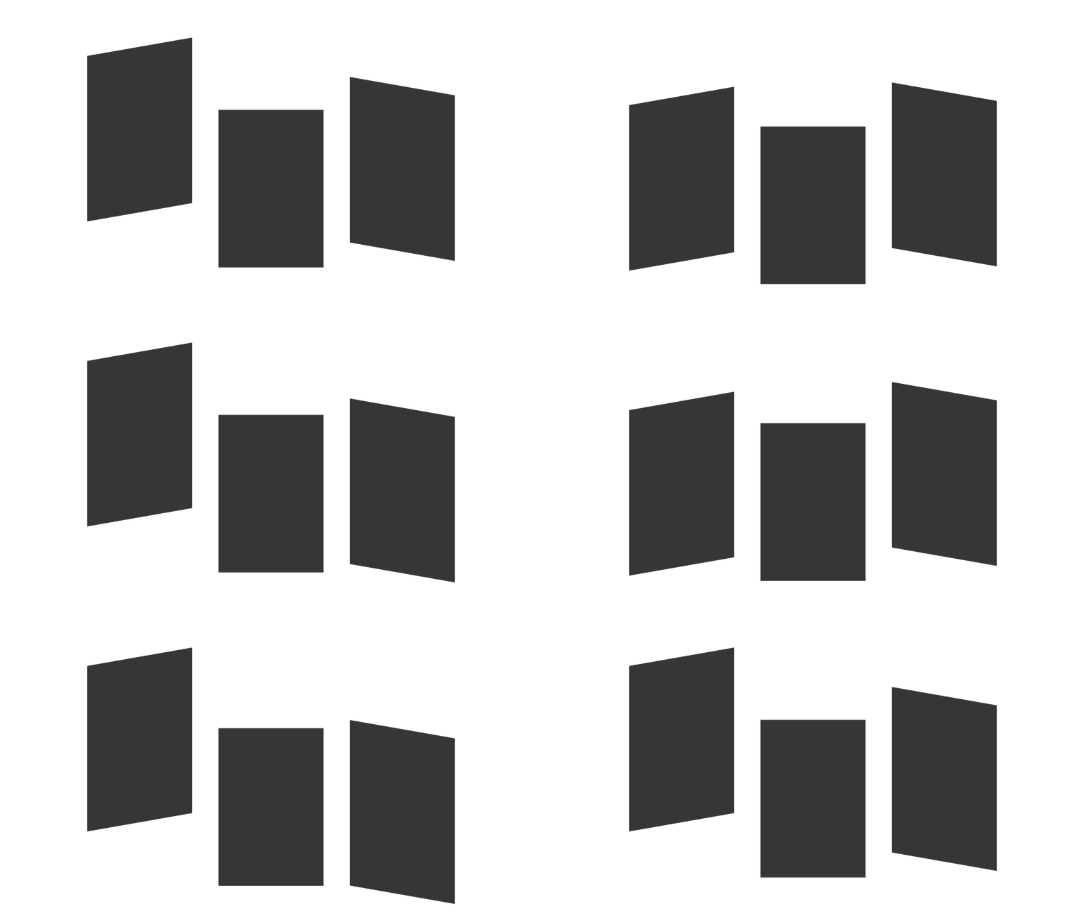
4. Variations of the logo. These conceptually and meaningfully communicate error messages (when and if they occur) as users navigate the site. I created two designs using the filled-in logo for two types of error pages to further reinforce a cohesive visual language for PPA.
Figure 12.1 shows three designs for a 404 Error page, displayed when a URL or page is not found. One instance of the logo “missing a page” appears randomly each time a 404 error occurs.
Figure 12.2 shows a design for the 500 error page, which is displayed when something unexpectedly goes wrong or is broken on the server. This design was created to visually communicate a collapse in the system.

Type
At this stage, my goal was systematizing the use of existing typefaces and their sizes, previously chosen by Xinyi Li, throughout the site to simplify implementation and to create a cohesive and extendable design system, increasing the designs’ adaptability for future revisions of the project. This approach stands in contrast to the previous one where type sizes of content would vary from one another even if they are within a section of the site on a single page . In order to ensure effective and efficient processes and results, I recorded and compared the typefaces used on the current site along with their sizes throughout each screen and across devices (desktop, tablet, mobile). The challenging aspect of this category of work was to avoid making drastic changes to the type choices, but rather revise them just enough to maintain a consistent typographical system across screens, sections, and devices while taking into consideration the recommended minimum and maximum type sizes for each device.
Content Hierarchy/Organization
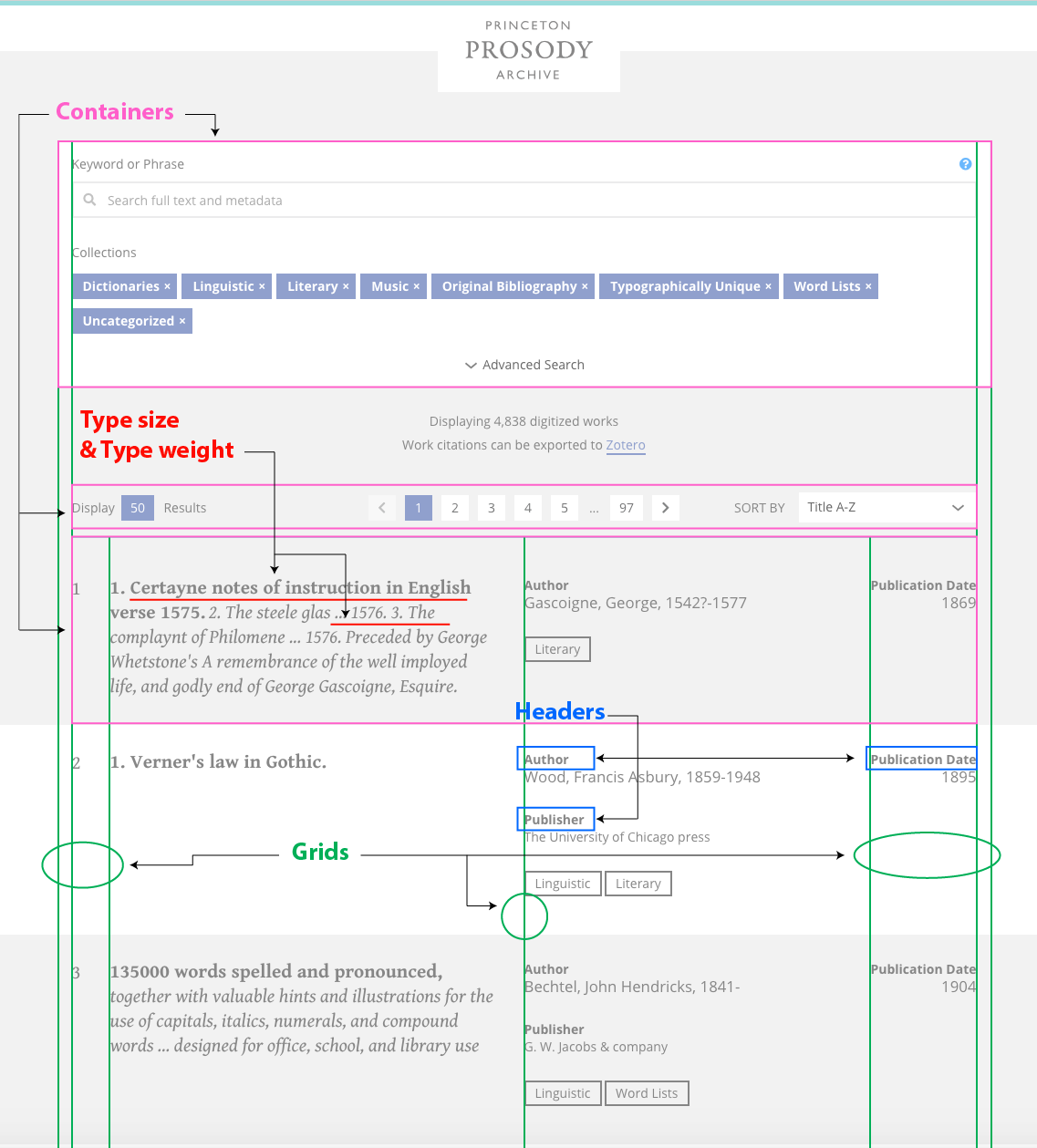
In this case, my goal was re-arranging content in the search results section to decrease cognitive overload. “Cognitive overload” refers to the amount of information that working memory can hold at one time. Because working memory has a limited capacity, digital interfaces should avoid overloading it with unnecessary and disorganized elements that do not help the user learn, find, and remember the information they need. This issue is often caused by a lack of clarity in the visual hierarchy and the grouping of information in the interface. The nature of PPA suggests that many of the pages on the site would be rather text-heavy for users, making it especially important to ensure that users can easily find what they are looking for on a page. In order to achieve this goal, pieces of information were visually grouped so as to be easily identifiable through the use of:
- Grids
- Headers
- Type size
- Type weight
- Containers
Annotated below:
Lessons Learned & Experiences Gained
It has been amazing to work on the Princeton Prosody Archive with the team at the CDH. This project is unique to me and my workflow because when I became involved most of its architectural language and structure had already been defined, created, accepted, and validated. What had to be revised was solely the project’s visual language, which needed to be more usable, accessible, and memorable. In this type of situation it becomes much more challenging to take systematic approaches for two main reasons:
- Joining the PPA after its journey through several iterations meant that my effort was spent on identifying potential gaps in the visual and architectural language and then trying to create a visual language that matched the goals of the project. This was a very valuable process, with a different set of challenges than if I had been involved in the project from the very beginning, in which case I would have created a visual language grounded in the contexts and outcomes of the architectural decisions. Entering the project when I did gave me the opportunity to holistically apply values such as ethics, transparency, and inclusion through usability and accessibility guidelines.
- I had to constantly keep in mind my limited context on the design concept and approaches taken so that I would not unintentionally make assumptions. This applied to several parts of the project, such as the original use of fonts, screen sizes, tools used, and the history and logic behind some of the inconsistencies in the documentation.
Despite my best efforts, I found myself revisiting the project branding – mainly the decisions regarding which versions of the logo would be shown for each environment (website, social media, and print). My lack of awareness regarding the printing restrictions for logos on promotional materials, as well as the implementation logic for the moving logo on the website, led to this process being one of uncertainty and unanticipated revisions. However, I acknowledge that this is inherent in the nature of the design process and I have learned a lot from this experience.
There were two approaches that helped me to get through this project as successfully as possible:
- Reminding myself to converse regularly with the developers at the CDH, especially our frontend developer Nick Budak, not only over the course of our collaboration, but also at some of the project’s specific decision-making moments for design. I had to constantly educate myself about some of the details regarding the history of the design-development processes at the CDH, taking into consideration Nick’s expectations and which processes he found useful and which he did not. Admitting that I do not know everything resulted in a very humbling and collaborative process.
- Keeping in mind a few extremely crucial points when working for the first time with a group of individuals on a project. As a new team member, this is the time when trust needs to be further earned on both sides; therefore, how I approach conversations and frame my priorities regarding the design, my process, and my values is extremely important because it can either break or make trust during this sensitive phase. Embodying consistency in values, ideas, directions, and priorities as a whole is important. As a Designer, I am also ethically responsible for considering how my way of collaborating and framing problems, priorities, and values would represent the Design community as a whole. The fact that it’s all about a system, not just me as an individual, makes this a very important topic that requires constant care and attention.
Edited by Rebecca Sutton Koeser, Meredith Martin, Rebecca Munson, and Mary Naydan.