Taste the Data!
15 May 2019

This spring, I taught a new Freshman Seminar at Princeton (FRS 154) called “Weird Data,” a CDH course sponsored by the Center for Statistics and Machine Learning. The goal of the course was to provide a wide-ranging introduction to the world of data in all its forms, ideas, and, well, weirdness. A key idea in this semester-long exploration was that data is not a single thing, nor is it usually as simple as we might assume.
The phrase “Data Cuisine” comes from a group of designers in Europe. They coined this phrase to describe a workshop that brings data viz folks together with chefs to explore new, embodied ways of representing data. One member of the group, Moritz Stefaner gave a presentation on the process (watch the presentation here).
I had been wanting to try the workshop in the classroom for a while, but it had proved tricky to translate into an undergraduate humanities course. The workshops in Europe used a lot of scientific and economic data. They had access to full kitchens and trained cooks, with plenty of time and ingredients to try out new ideas. We wouldn’t have any of that in a classroom. But maybe we could try! I went to the grocery to look for foods that would have some kind of distribution of colors, tastes, and sizes. That wound up including condiments (mustard, ketchup, BBQ sauce) and candy (jelly beans, Starburst, Peeps, Fun Dip).

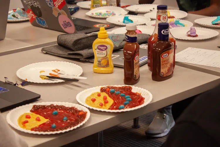
Condiments and candy representing data (Photo: Gissoo Doroudian)
We began by reading a bunch of essays on “data.” We tried to teach ourselves how to question not just the data but the categories themselves. Who determines the categories, and what are the consequences? Rather than simply adopt the data viz practices so common in corporate environments, we took inspiration from what Giorgia Lupi calls “data humanism.” How does the representation of data shape what we see, how we think, and how we exist in the world? Do we always have to contort ourselves to correspond to data? Or can quantitative displays respond to the messiness of our lives, cultures, and identities? The course syllabus covered many approaches to these questions.
As framing, we reviewed the opening chapter from Ben Fry’s helpful book, Visualizing Data. In the chapter, Fry proposes an iterative process to creating graphical views of data.

Fry proposes an iterative process to creating graphical views of data (Credit: Fry, Visualizing Data, page 15)
For data, students could choose from our class collection (I spent much of the semester slowly adding to a list of Datasets, Collections & Repositories). With 13 students in the course, we broke into three groups of 4-5 students. The groups chose datasets on police-related fatal shootings, on migration patterns between states in the US, and on the intergenerational effects of education.
Next, we sketched ideas on paper to perform initial analyses. Students in the course liked using the website WTFcsv to get quick snapshots. As each group began to sketch out their ideas, they began to raise creative questions. What are the meanings behind various foods, and how might those meanings inform the representation of data? Practically speaking, how might we move past the mental shortcuts of conventional charts to craft more humane visualizations? Could bending and breaking the conventional forms allow us to interact with the data in richer and more affective ways?
The usual forms got boring, fast. Earlier in the term, we had talked about how the common data viz graphs are mental shortcuts. They are meant to convey a lot of info efficiently. Sometimes, that’s useful if, say, you are a corporate executive making financial decisions. But humanistic data isn’t always (or ever?) reducible to such distillations. Instead, the students began to explore the freer forms of the candy & condiments. How, we discussed, can the sensory experiences of food provide an embodied way to explore the knowledge? In practical terms, the arrangements of taste, texture, and smell of foods can tell us a lot.
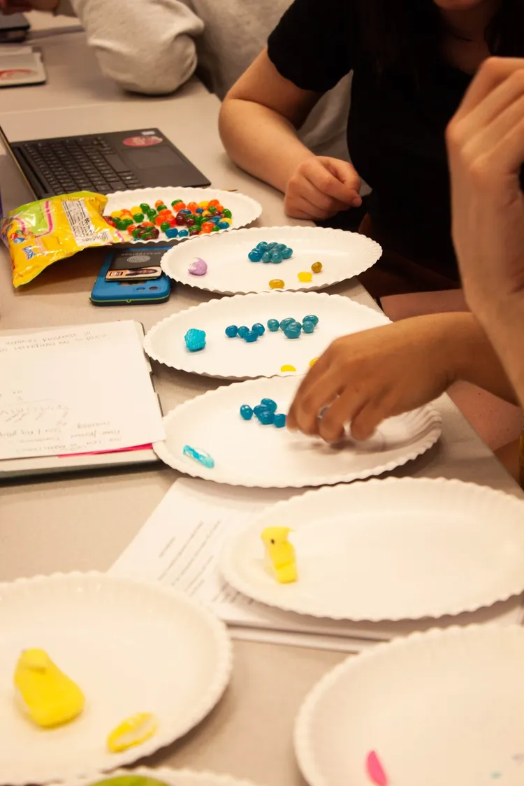
One group made clever use of taste. They created an exploratory representation of a dataset using sweet and sour jelly beans. First, they sorted the categories of the data into separate plates (here, levels of formal education). Then, they began to count out jelly beans in proportion to the increases or decreases in the data. For every 10% drop in education, they added one blue sour jelly bean. For every 10% gain in education, they added one blue sweet jelly bean.
Because all of the jelly beans were the same color, the only way to “compute” the trends in the data was to eat a handful of jelly beans and to see what our taste buds noticed. The tastes results were revealing. Some sweeter or more sour than others, indicating different trends. But chewing all those jelly beans slowed the process of “consuming” the data way down. It made for a rather different experience.

Using sweet and sour jelly beans to show increases or decreases in the data (Photo: Gissoo Doroudian)
The other groups also played with the relatively free-form nature of the exercise to create visualizations that allowed for multiple perspectives, supplemental data, and a real sense of the relations between the categories of the data.

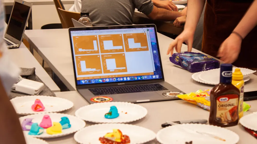
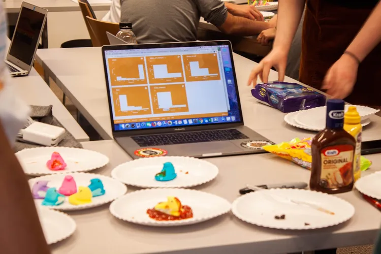
Marshmallow Peeps help familiarize students with data visualizations and analysis (Photo: Gissoo Doroudian)
All in all, it was a fun activity. We had spent several prior sessions on data visualization, but I could see this lesson working just fine on its own. Loosening ourselves from the constraints of conventional tools allowed us to think more creatively and, surprisingly, even more concretely about the minute details involved in our representations of data. After this activity, I noticed a significant uptick in the students’ familiarity with data visualizations and analysis. It's certainly something I plan to try again.